PAUL DONOVAN is chilled by the contemporary resonance of Harper Lee’s coming of age tale amidst racism and white supremacy in this excellent production

The ABC of Typography by David Rault
Excellent graphic account of how written word in print and online came into being

GEOFF BOTTOMS recommends the unashamedly light-hearted escapism on offer in this stage version of the 1963 film
Full of mysterious religious references and radical sound design, the Scottish duo’s new offering is candidate for album of the year, suggests SIMON DUFF
MARY CONWAY revels in a powerful reminder that human lives are not defined by physical perfection
PAUL DONOVAN recommends the fine performances in this account of the pre-war meeting between the US president and the British king
TECLYN AROD relishes an intimate celebration of jazz improvisation that mixes local and national musicians


THE alluring idea behind David Rault’s entertaining and instructive comic book The ABC of Typography is that a graphic account of the development of Latin script would introduce a new generation to the historical framework in which the visual appearance of the written word developed.
Comic books appeal to a very wide readership, from pre-school children through to earnest intellectuals, and their great facility in conveying complex ideas in an accessible way makes them an ideal medium for the instruction as well as entertainment that this book provides.
Similar stories

RUTH AYLETT recommends that this mixture of memoir, diary and poetry by a young Gazan writer be read as widely as possible
JULIA THOMAS unpicks the mental processes that explain why book-to-film adaptations so often disappoint
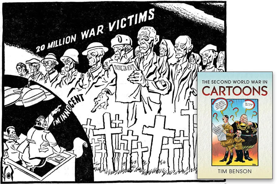
Star cartoonist MALC MCGOOKIN finds lessons for today in the punch, and the economy of line, of an extraordinary generation of illustrators

BLANE SAVAGE recommends the display of nine previously unseen works by the Glaswegian artist, novelist and playwright