MARIA DUARTE recommends a remarkable study of the friendship between a Palestinian and a Pakistani, broken by a hostile state


 Latest editorial

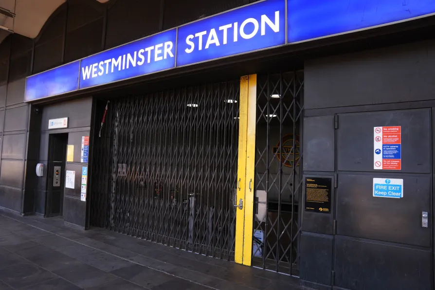
Johnston spells London
MICHAL BONCZA reports on an exhibition on the typeface created a century ago for the capital’s
Underground which has come to represent not just transport but the image of the city itself

MATTHEW HAWKINS rakes through un-fancy words and flair-free summaries to find who and what might be flamboyant
PETER MASON is exhilarated by an exciting, well-considered and historically minded tribute to the great Trinidadian instrument
Reducing historical lives to ‘male’ and ‘female’ roles, we lose the nuance of those lives and a clearer understanding of past societies, suggests CLAIRE ISABELLA GILMOUR
CHRIS SEARLE relishes the genius of pianist Alexander Hawkins, his many ensembles, and his new album





HARRY BECK’S London Tube map of 1931 is recognised globally as a graphic icon. Yet few recognise the name of the creator of its equally memorable typeface, the Uruguay-born calligrapher Edward Johnston.
This year marks the centenary of the inauguration of the Johnston typeface, used not only on the map but for all the Tube’s public information signage. Modernist, lucid and emanating serenity in the visual noise of an increasingly complex world, it’s designed to never be confused with advertising and has established one of the most durable corporate typographic identities to be found anywhere.
Johnston’s brief was to create a lettering system for London Underground that would have the “the bold simplicity of the authentic lettering of the finest periods” and belong “unmistakably to the 20th century.”
Similar stories
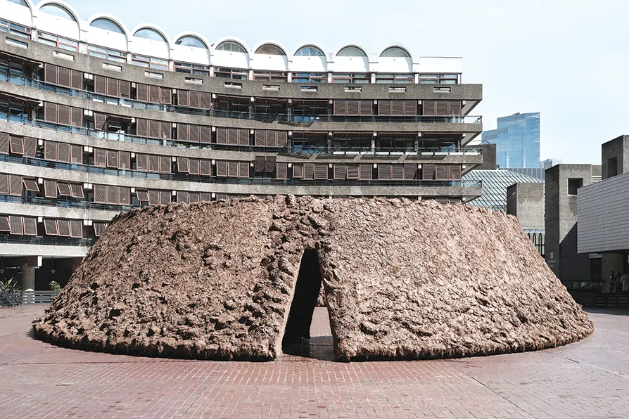
MICHAL BONCZA recommends a minimalist installation that prompts intriguing connotations
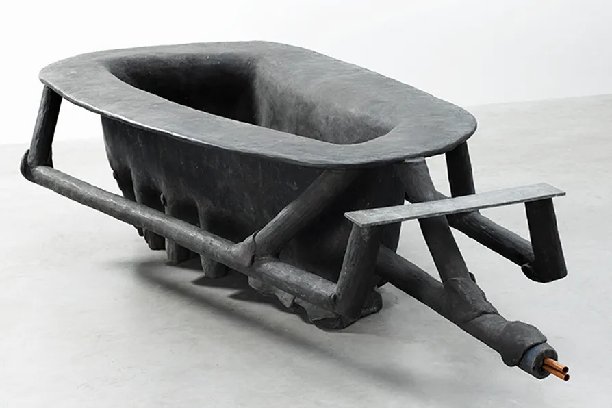
JAN WOOLF ponders the works and contested reputation of the West German sculptor and provocateur, who believed that everybody is potentially an artist
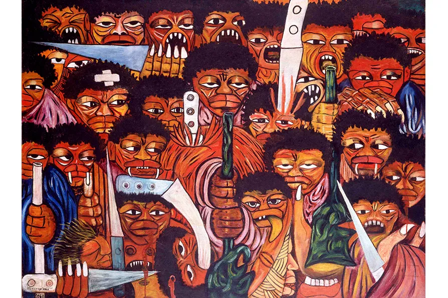
JOHN GREEN welcomes a remarkable study of Mozambique’s most renowned contemporary artist